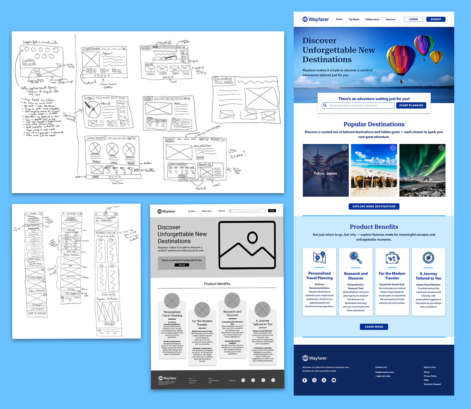
As part of a 9-week UI design course with Designlab, I set out to design a platform that could spark curiosity in travelers through emotionally driven UI. My goal was to make Wayfarer feel more like an experience than a tool—vibrant, human, and inspiring. Coming from a print background, I initially struggled to balance expressive storytelling with the simplicity and functionality that digital design demands.
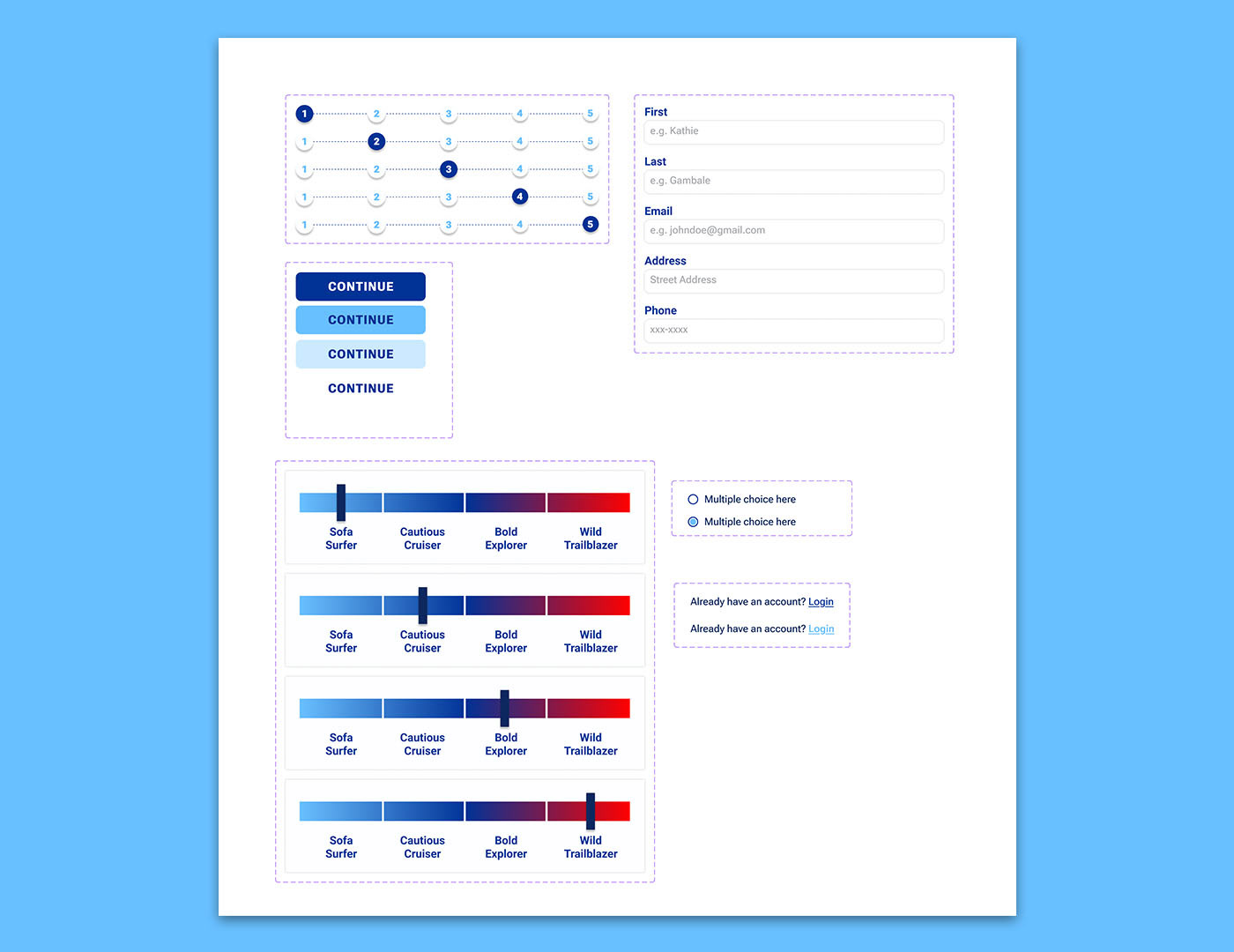
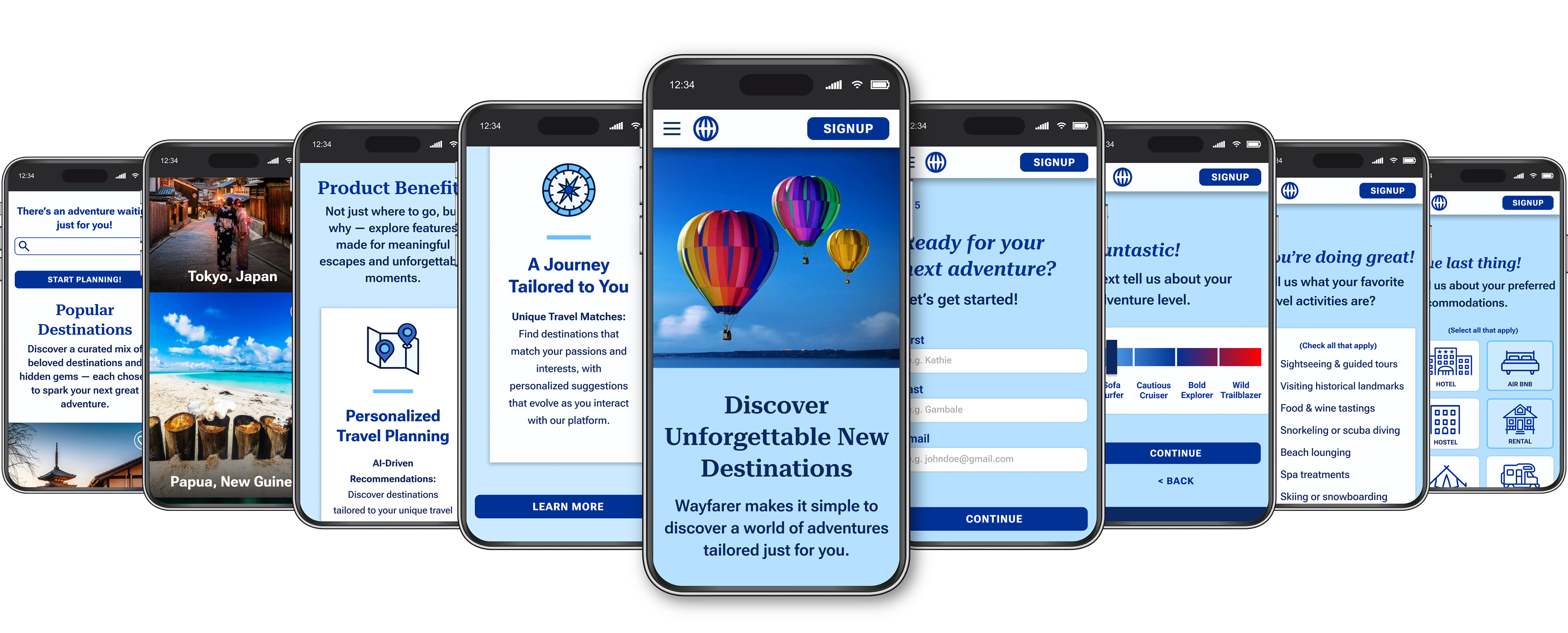
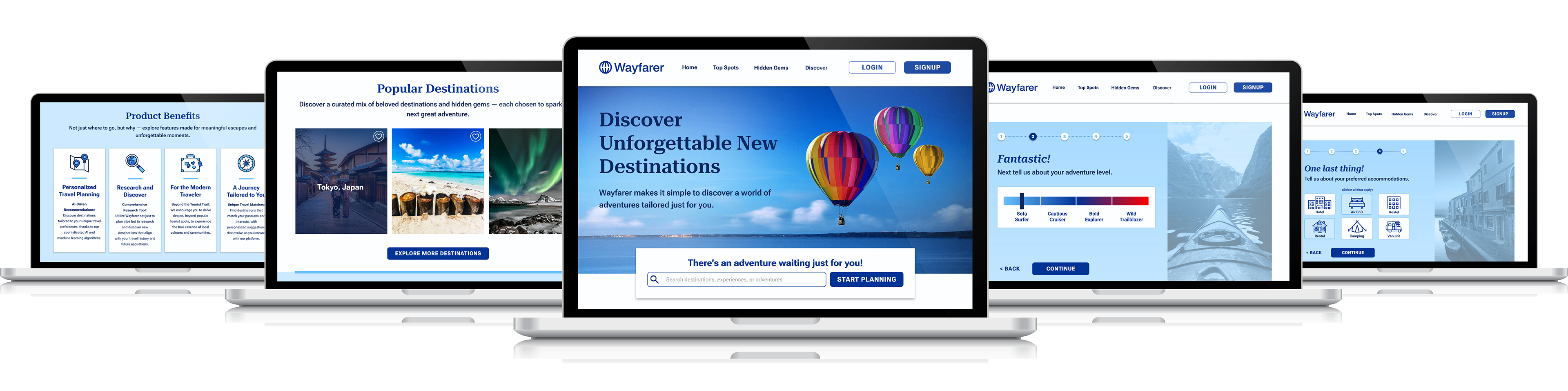
To resolve this, I built a complete visual system from the ground up using Figma, including custom icons, wireframes, responsive layouts, and UI components. Throughout the process, I refined the structure, simplifying layouts, reordering content for better flow, and adjusting how icons and images were integrated. I also implemented auto layout and smart components to make the system scalable across devices, particularly for mobile.
I intended to go beyond the typical travel app and design something that encouraged exploration of lesser-known destinations. I focused on crafting an experience that would resonate emotionally while still being easy to navigate, approachable, and trustworthy.
The final product was a cohesive, story-driven interface that balanced structure with spontaneity. Streamlining the icons, improving layout clarity, and reorganizing content dramatically enhanced usability and visual consistency. The result is an experience that feels calm, inviting, and intuitive, supporting the user’s sense of wonder as they explore the world.
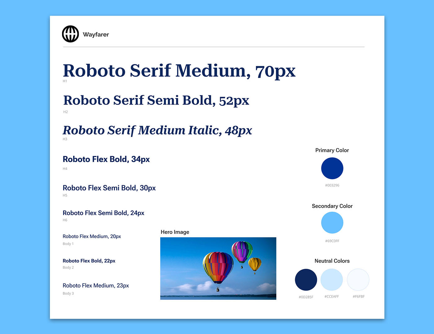
Typography and Color
Choosing fonts was more difficult than expected. Coming from a print background, I initially leaned toward more decorative and complex choices. However, as I refined the UI, I learned to prioritize legibility and clarity, especially across devices. Clean, modern type choices helped maintain a professional yet approachable tone, ensuring consistency across the visual system and elevating the reading experience.
My initial palette featured green, yellow, and blue, but it lacked cohesion. Over time, I transitioned to a fully blue-based palette with varied shades and tints to evoke trust, calm, and sincerity—key feelings for an emotionally driven travel platform. This refined palette also gave the photography and interaction space to shine, rather than competing with it. It was a good reminder that simplicity can be powerful when used intentionally.