This case study was part of a 9-week UI design course with Designlab, where I set out to design a platform that sparks curiosity in travelers through emotionally driven UI. I wanted Wayfarer to feel vibrant and inviting—less like a tool, more like an experience.
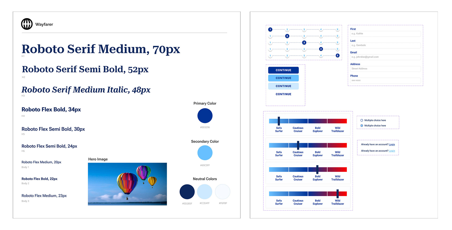
To support that vision, I created a cohesive visual system from scratch: custom icons, a tailored color palette, wireframes, form design, and sketches. I focused on highlighting hidden gems and authentic experiences, using a blue palette to convey trust and serenity while letting photography and interaction shine.


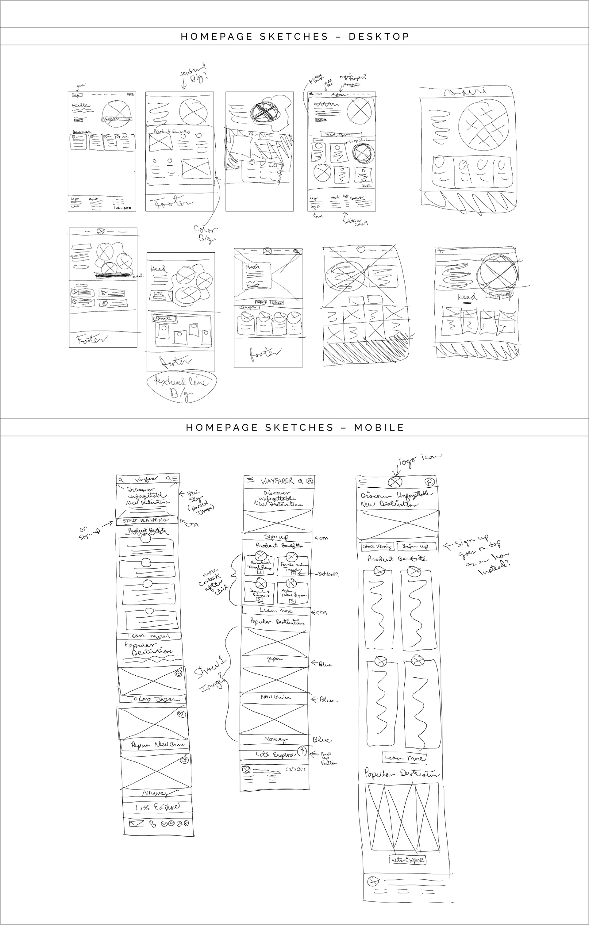
First iteration of a homepage layout, featuring a hero section, product benefits, and footer.

Style Tile showcasing font and color choices, along with key UI components.
Early on, I explored different layouts and styles, aiming for a sense of narrative and flow. As the project evolved, I refined the structure—reordering sections, simplifying icons, and improving layout clarity. I used Figma’s auto layout and smart components to build responsive versions and bring flexibility to the system.
In the end, Wayfarer became more than a UI project—it was an exercise in restraint, rhythm, and storytelling, with every decision made to support the user’s sense of exploration.
