FMAA™ (Financial and Managerial Accounting Associate) is a certification designed for young professionals looking to build a strong foundation in finance and accounting. When I was tasked with developing its visual identity, I saw an opportunity to give the brand a fresh and energetic tone that would resonate with a younger audience, while still aligning with the broader identity of IMA — the global association of accounting and finance professionals that created the certification.
I crafted a set of supporting graphics and a stylized visual system to ensure consistency across all FMAA-branded materials. This approach not only gave FMAA a clear visual voice but also reinforced cohesion with IMA’s other certifications. The result is a dynamic and approachable identity that strengthens brand recognition, invites engagement, and speaks directly to its target audience without losing its connection to the parent organization.

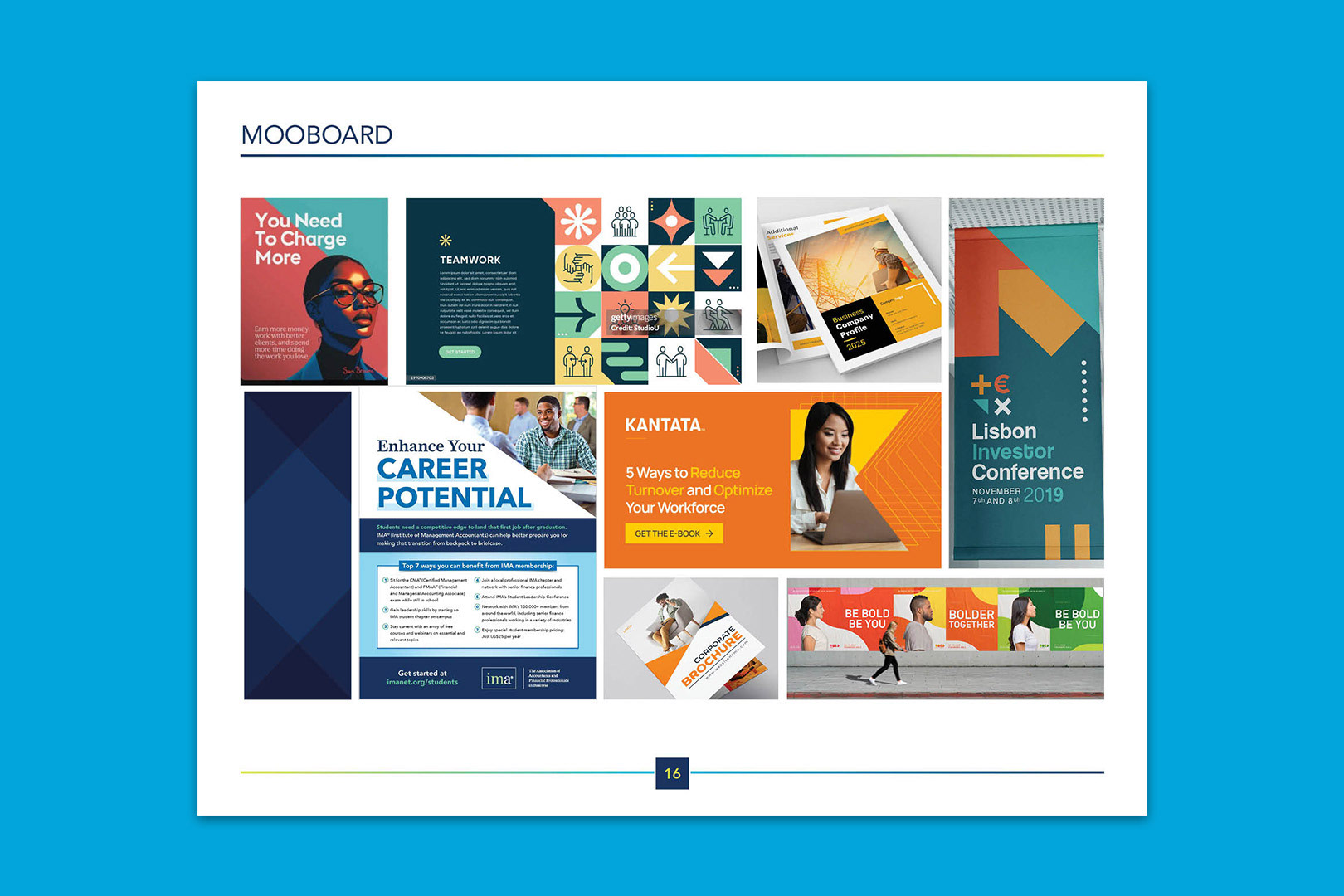
MOODBOARD
These elements were chosen for its clean, modular structure and youthful, confident tone. The layouts are bold but approachable—balancing clarity with visual interest. Each piece features strong typographic hierarchy, clear messaging, and a modern editorial feel that resonates with young professionals. The use of overlapping elements, angled shapes, and grid-based design adds movement and energy, aligning with the FMAA's goal of inspiring early-career individuals to take action and grow confidently in their field.
PHOTOGRAPHY
Photography for the FMAA brand should reflect a youthful, modern energy while remaining clean and intentional. Images should feature diverse models between the ages of 18–25, styled in contemporary clothing and placed in bold, modern settings. Model poses can vary—either directly engaging with the camera to create a sense of connection, or facing away to evoke an aspirational feel.
Silhouetted shots (either full- or half-body) are preferred, especially when models are interacting with simple props like desks or chairs. These images work best over brand-colored backgrounds to maintain visual consistency. When using original photography, opt for natural, uncluttered environments and avoid overly busy or distracting backdrops. The goal is to maintain focus on the subject while supporting the fresh, vibrant tone of the FMAA identity.

TYPOGRAPHY AND COLOR
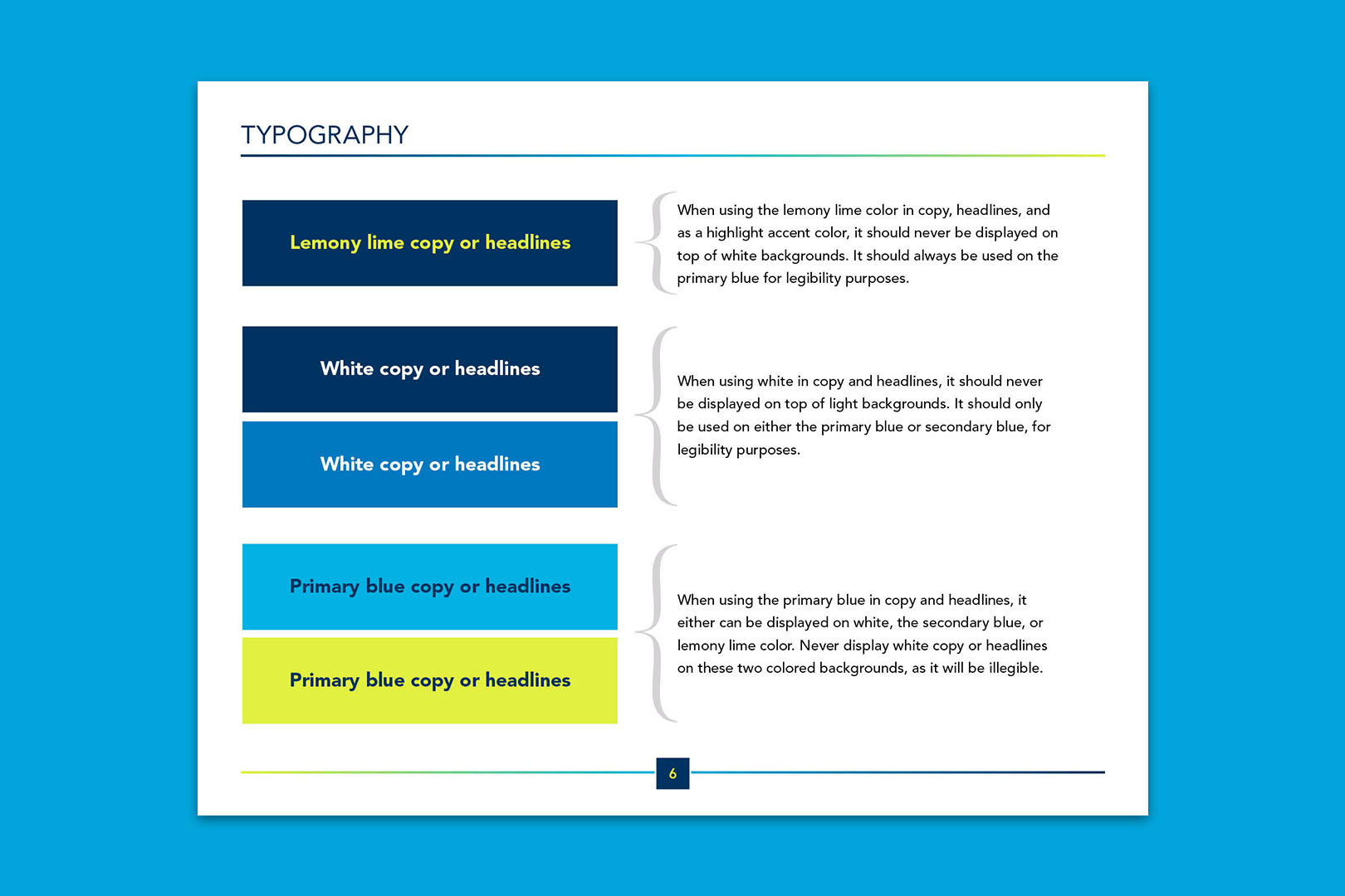
A key challenge in developing the FMAA brand was maintaining legibility while using a bold and youthful color palette. To address this, I designed a vibrant gradient using IMA’s core blues and introduced a standout accent I call “Lemony Lime.” This lively and energetic color added a fresh and modern feel to the palette, helping the brand connect with a younger audience.
Lemony Lime, however, lacked contrast on lighter backgrounds, so I limited its use to pair with the primary blue for better clarity. Similarly, white text was only used on primary or secondary blues to avoid readability issues. The primary blue proved to be the most versatile, working well even when layered over Lemony Lime. These clear usage guidelines helped ensure the brand remained polished, legible, and visually consistent, supporting FMAA’s mission to engage and educate the next generation of financial professionals.
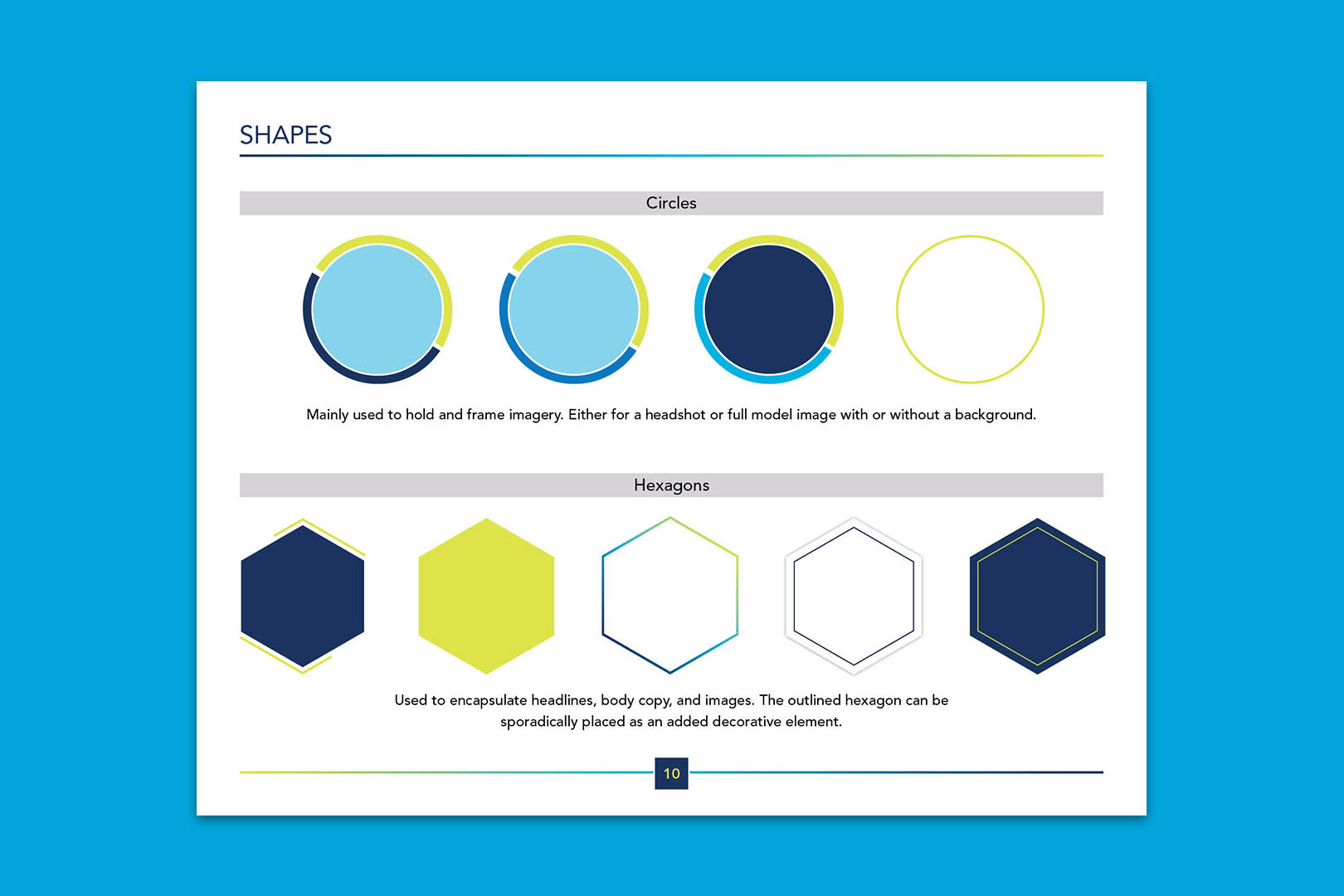
Shapes
Shapes play an essential role in the FMAA visual system, helping to organize content and reinforce brand personality. Circles are primarily used to frame imagery, whether headshots or full-body photos, with or without backgrounds. Their clean, approachable shape adds warmth and clarity, especially when highlighting individuals.
Hexagons serve a more versatile purpose. They are used to contain headlines, body copy, and imagery, creating structure and visual interest throughout layouts. An outlined hexagon is also used as a decorative element, placed strategically to add depth and energy without overwhelming the design. Together, these shapes bring consistency across materials while enhancing the bold and youthful tone of the FMAA identity.
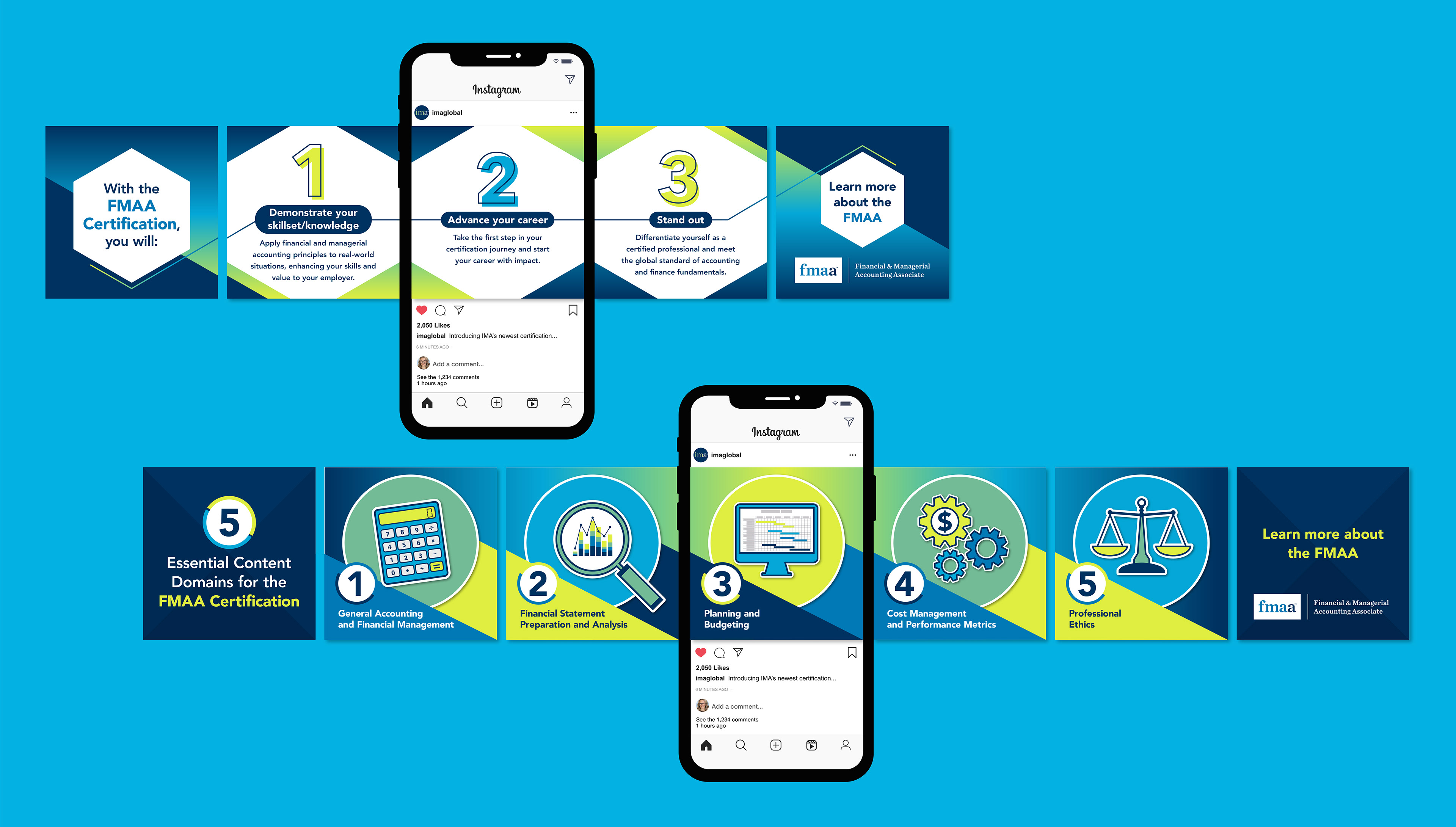
Digital and Print Assets