ESPN the Magazine
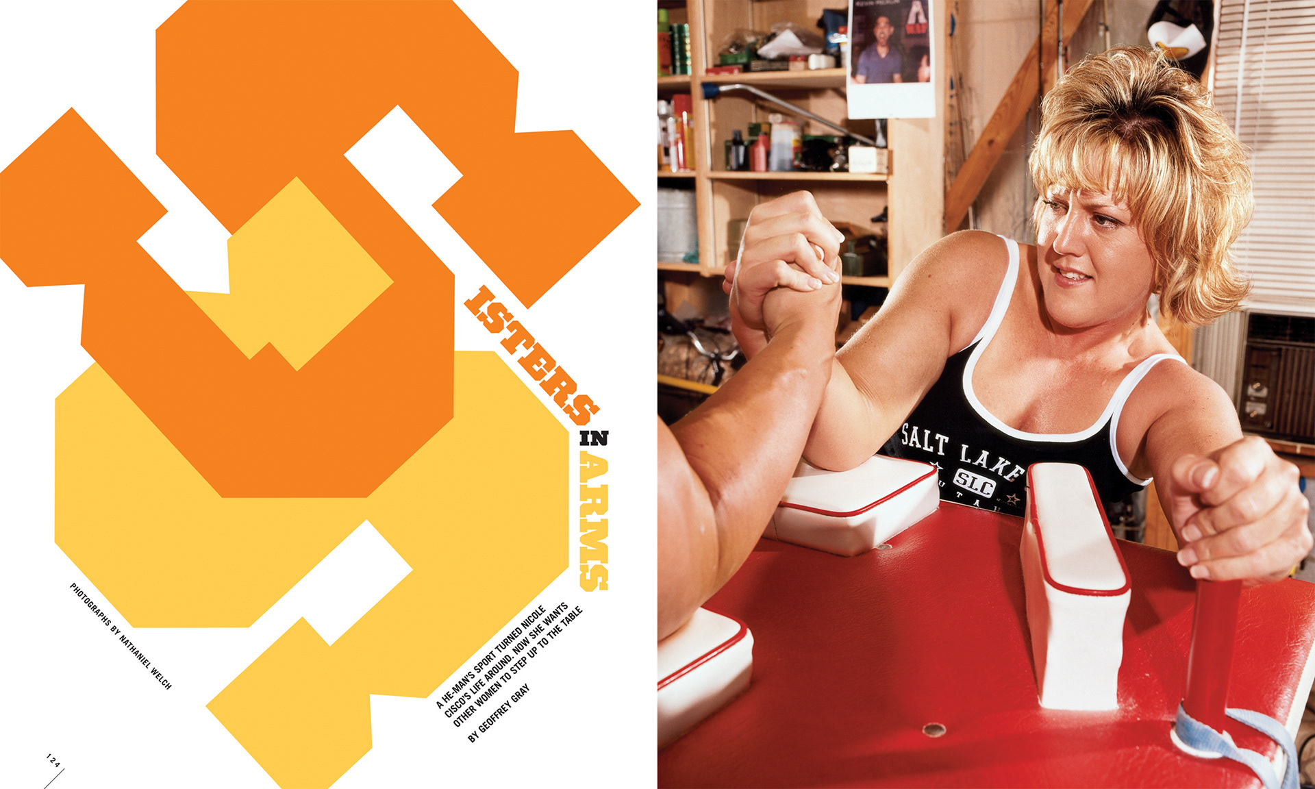
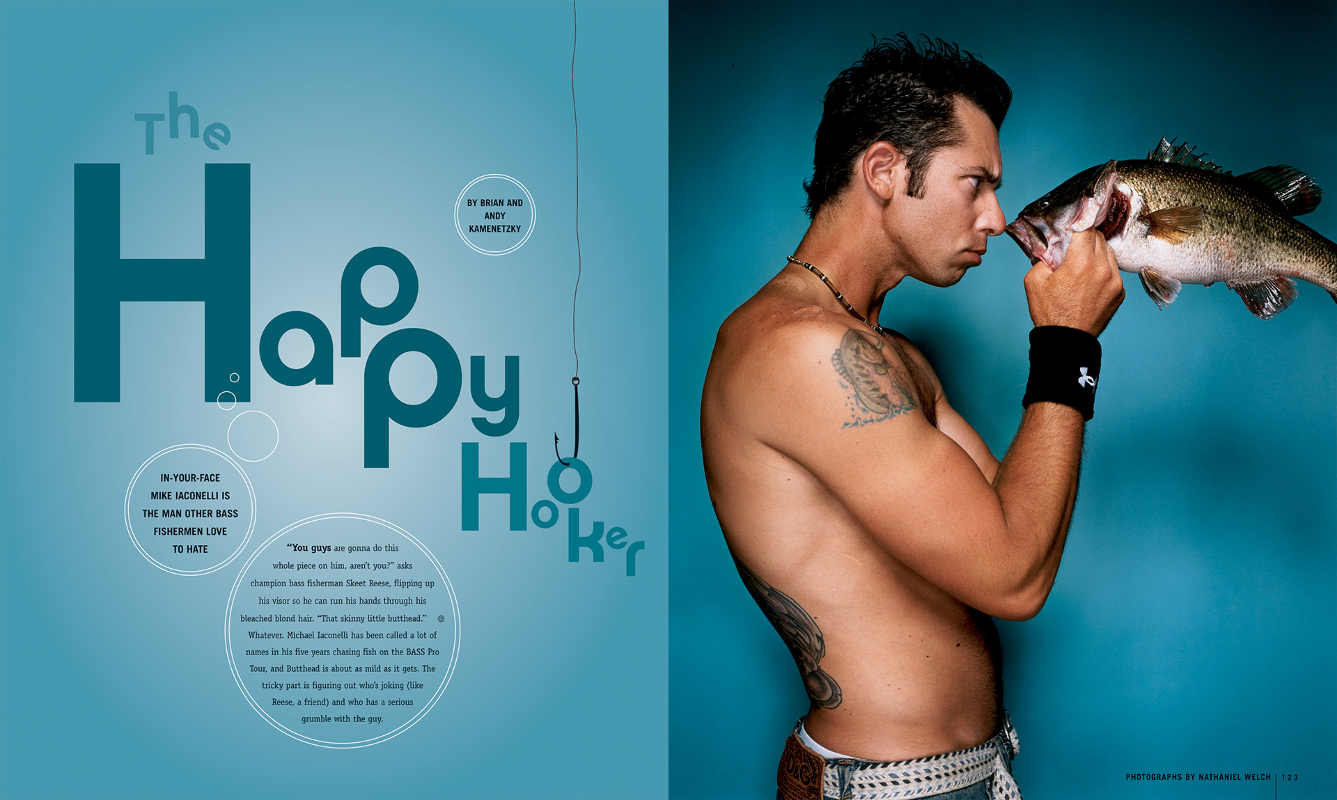
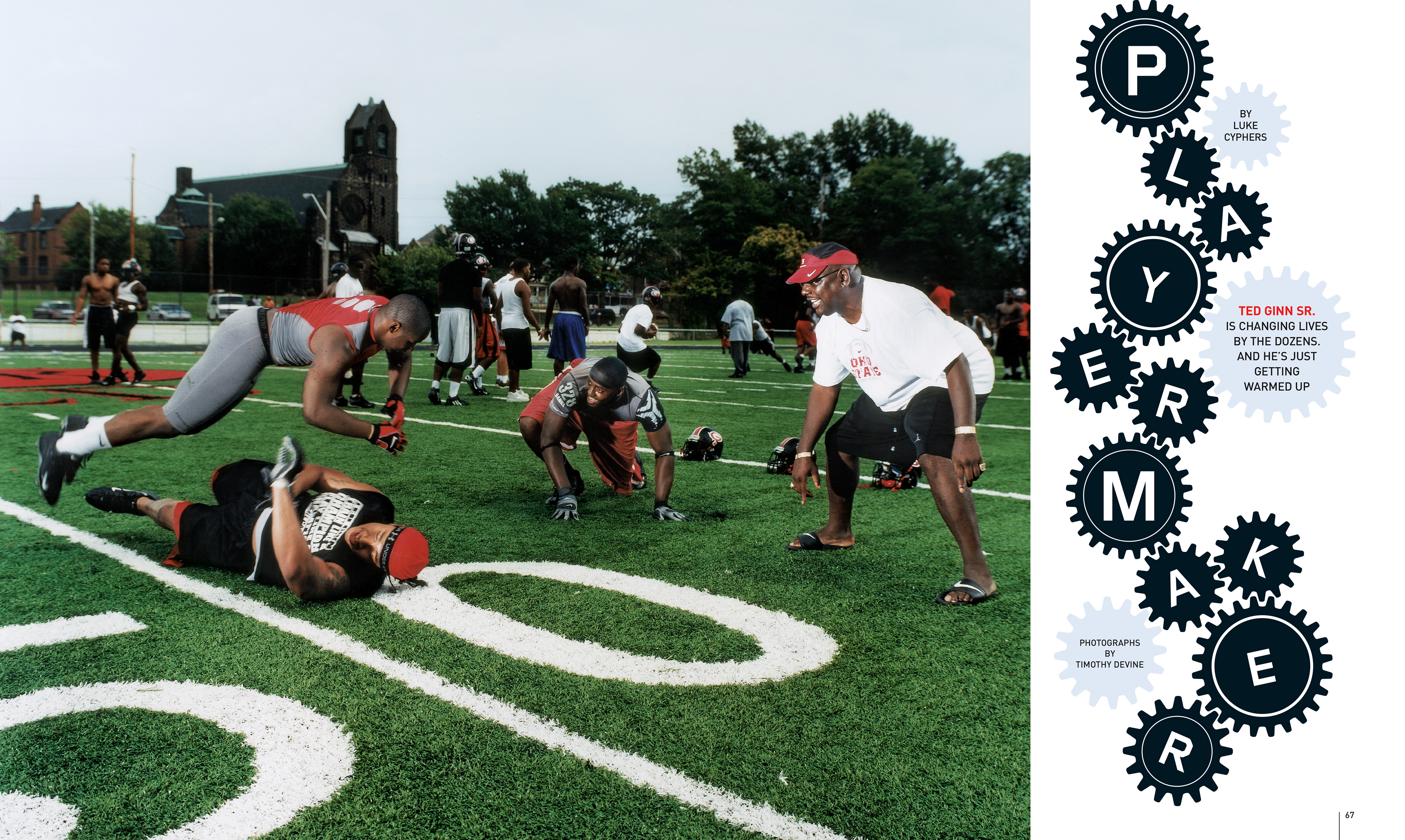
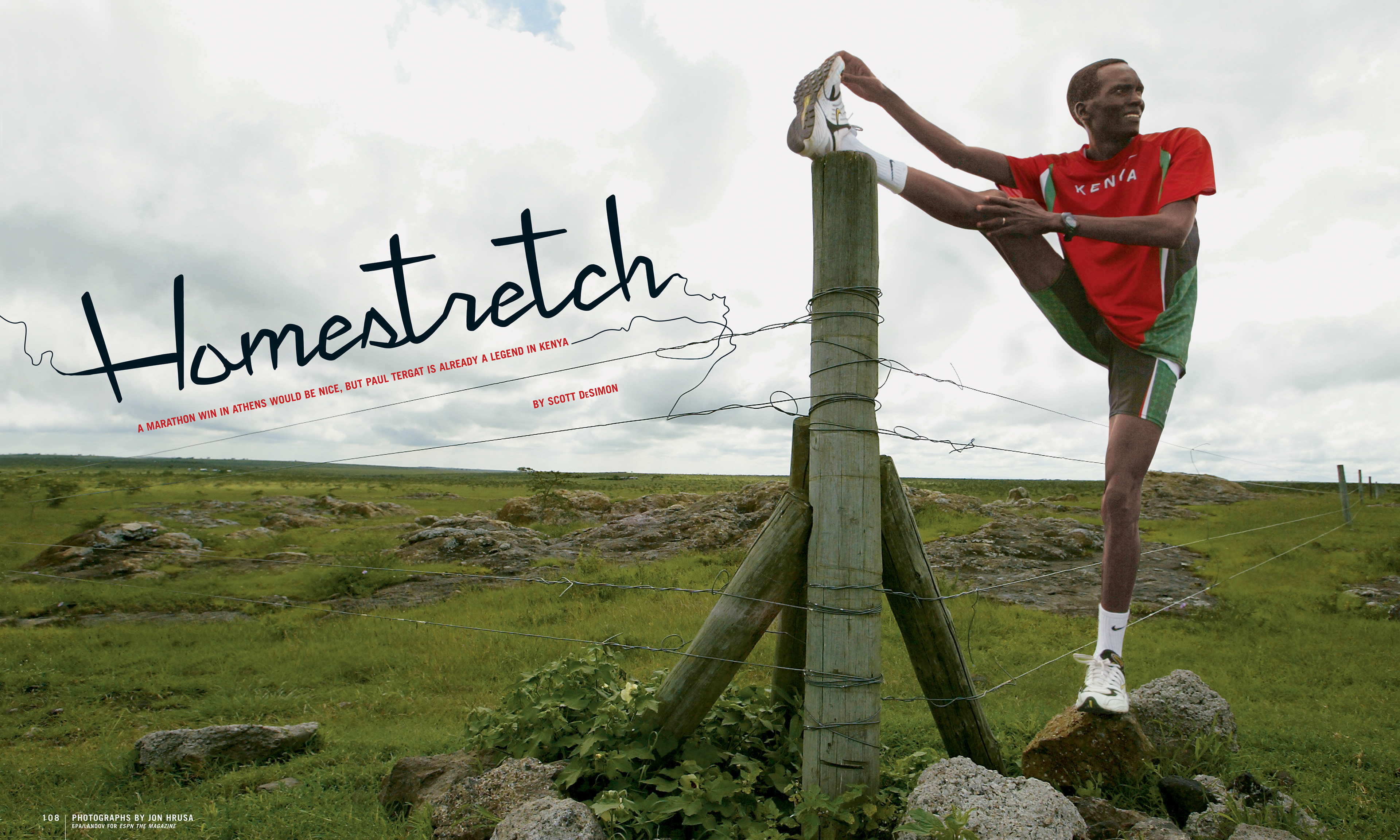
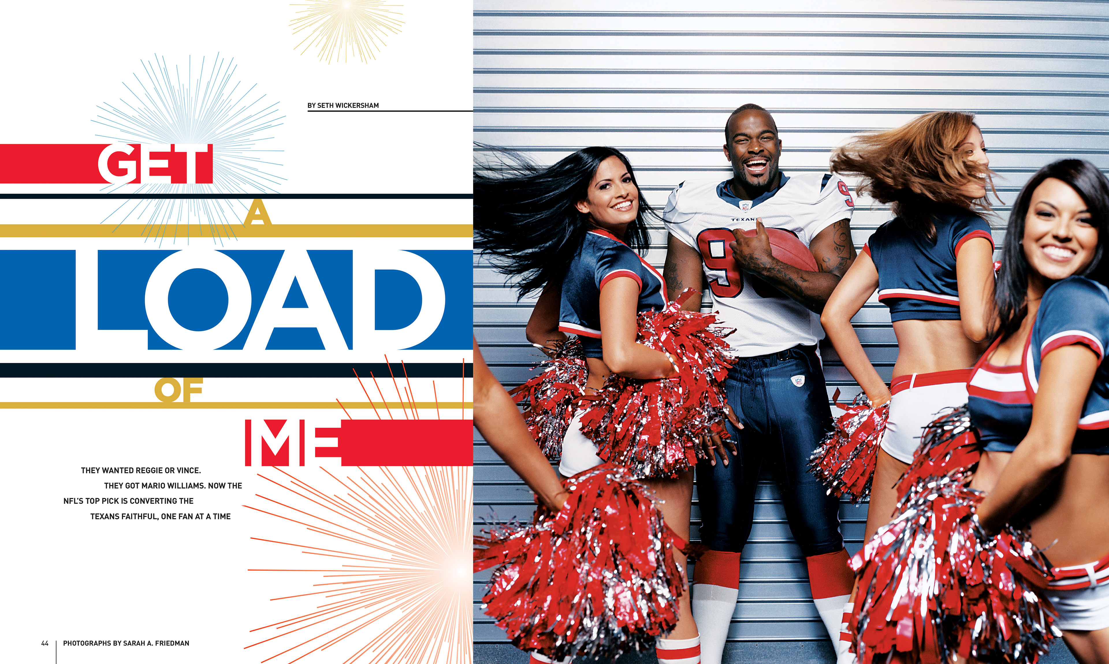
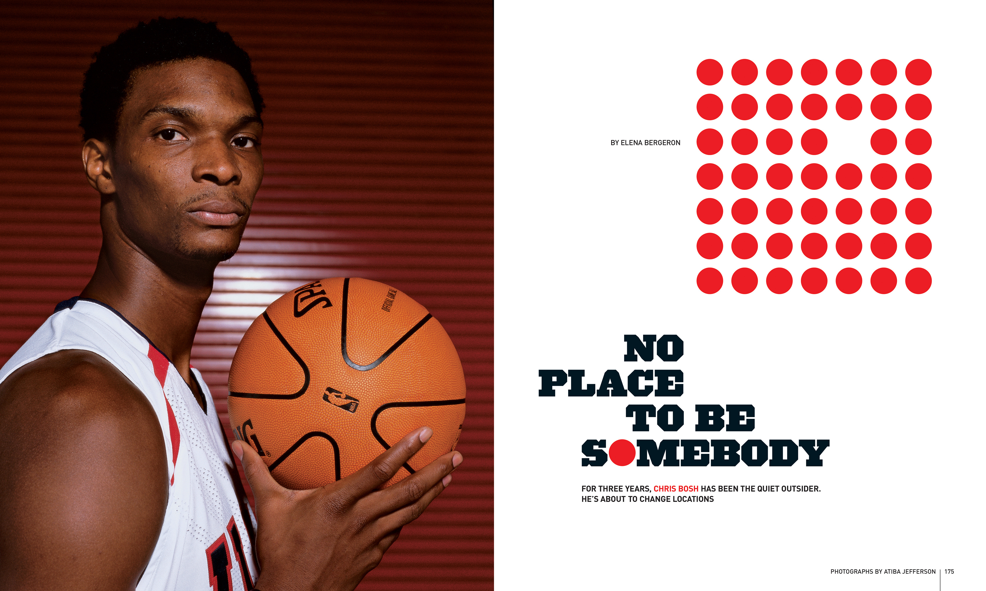
Working at ESPN The Magazine was a dynamic and creatively charged experience. It awakened a deep conceptual side of me that I hadn’t fully realized and sparked a lasting love for typography. I learned how to think strategically and solve problems through expressive type, using it as a storytelling tool. Sports carry a natural sense of strength, movement, and coolness, and we channeled that energy into the design to amplify the voice of sports writing.
My work has also earned recognition in prestigious publications, including the Society of Publication Designers Annual and the Type Directors Club Annual, for standout feature designs such as “Sister in Arms,” “Happy Hooker,” and “Player Maker.”

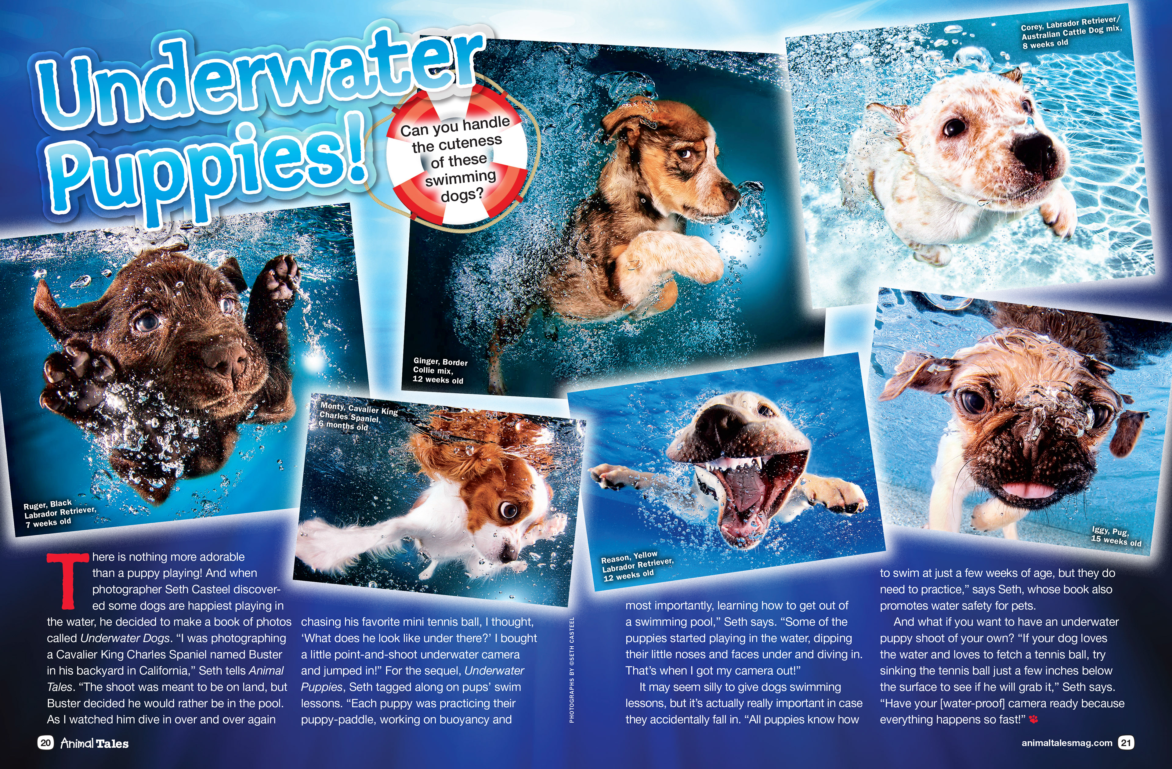
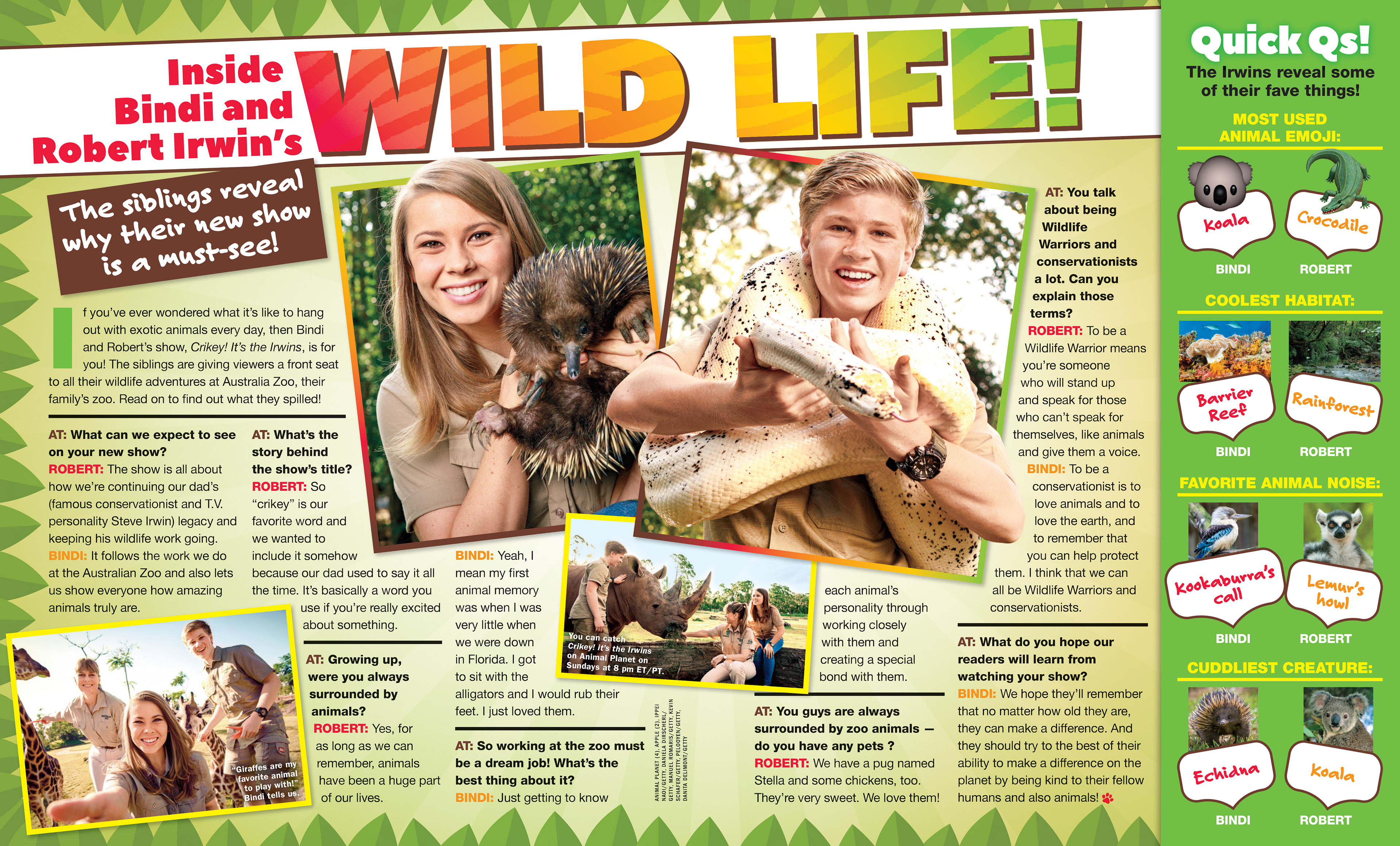
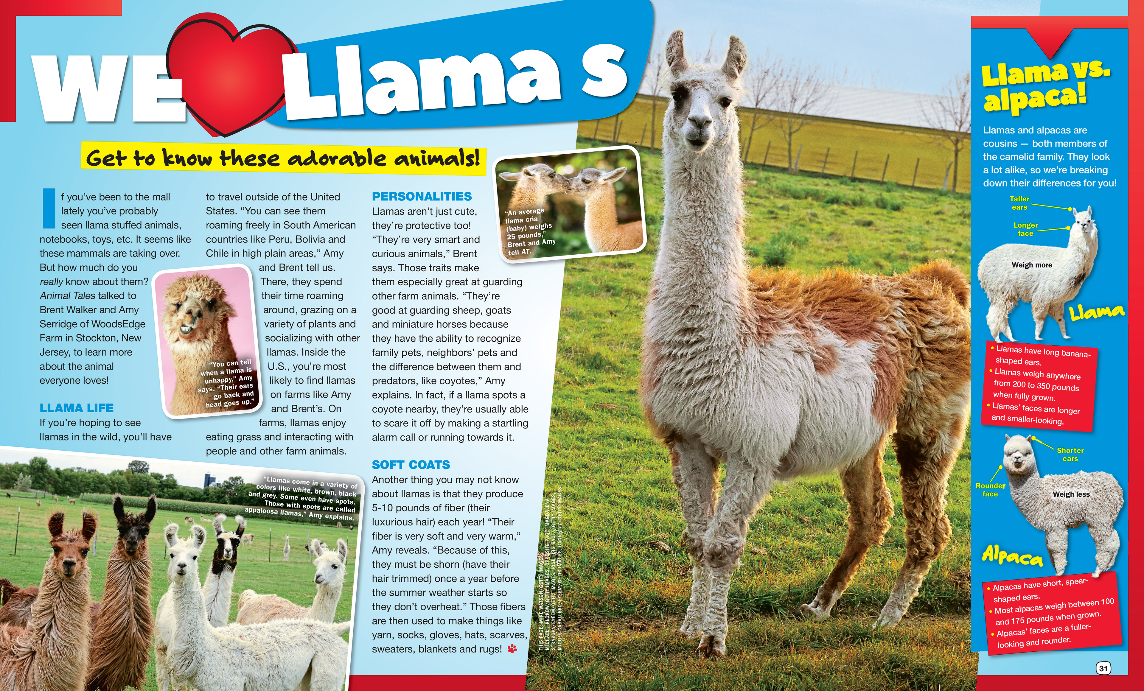
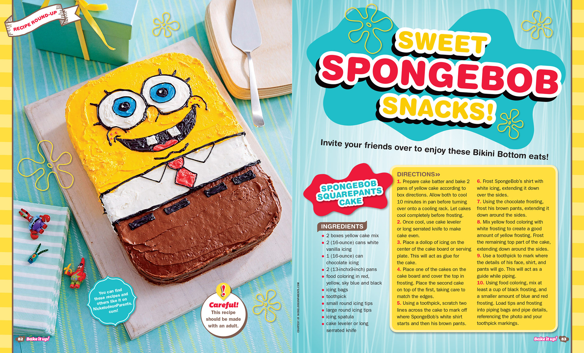
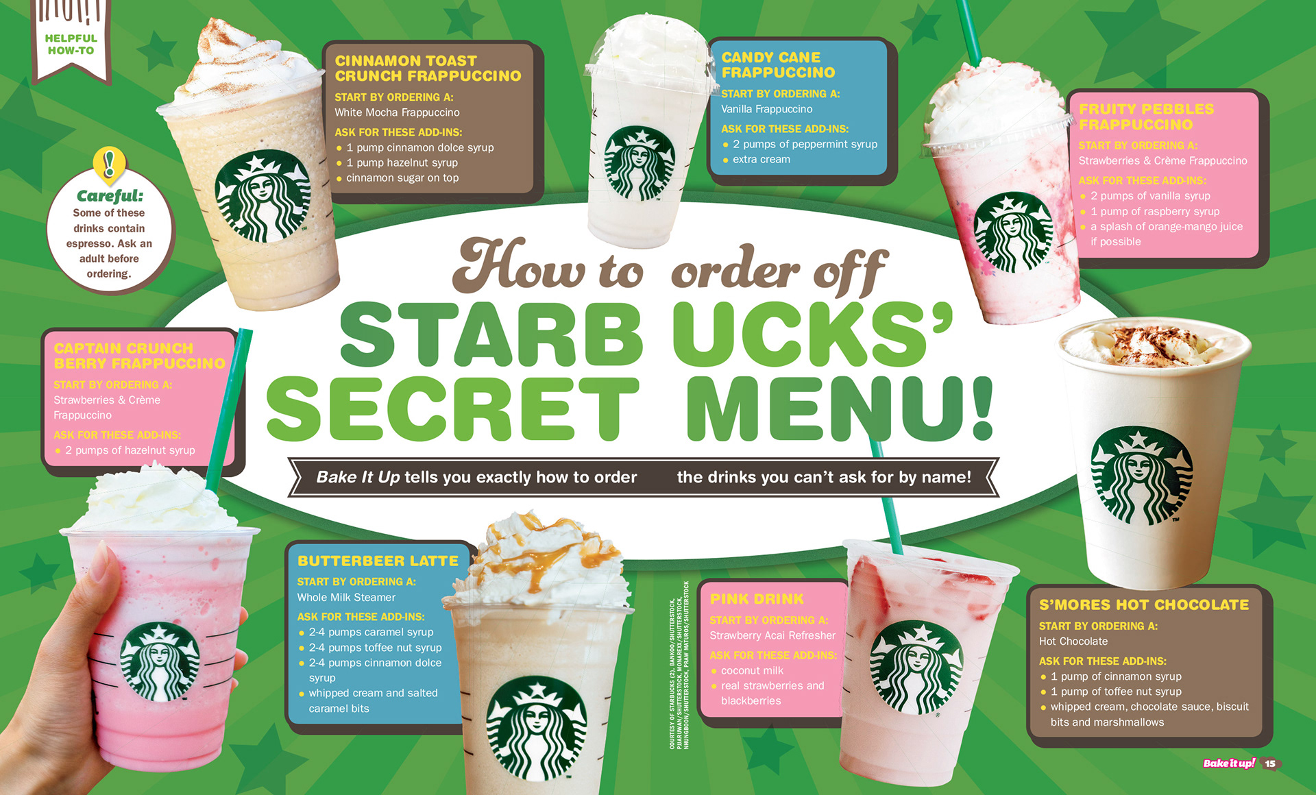
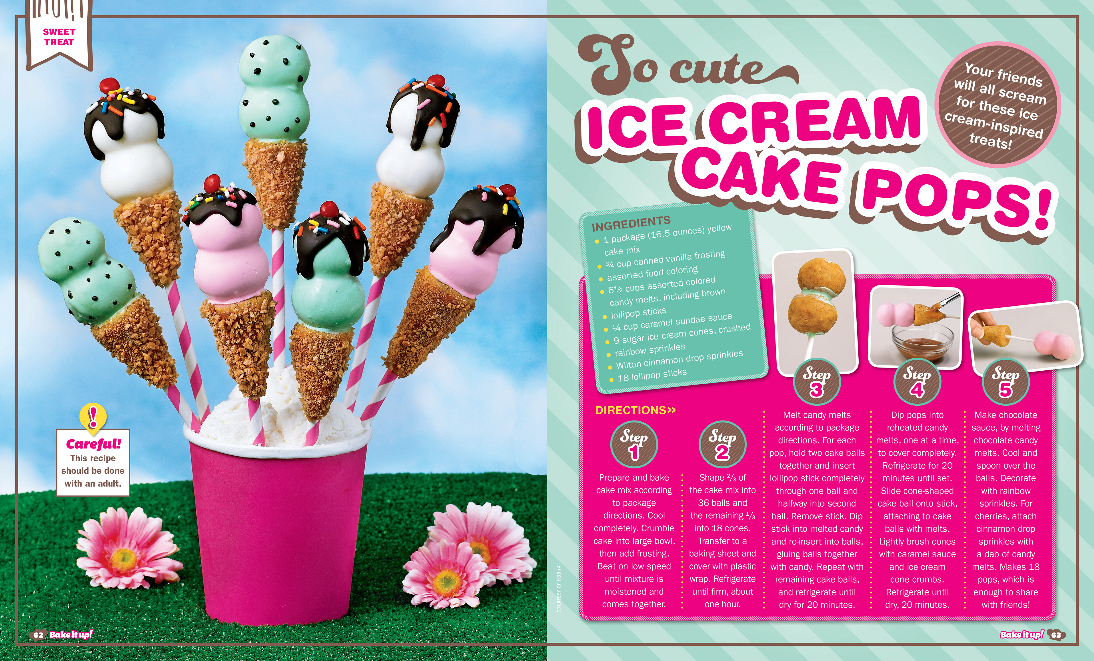
Kid's Publications (Girls' World, Animal Tales, and Bake it up!)
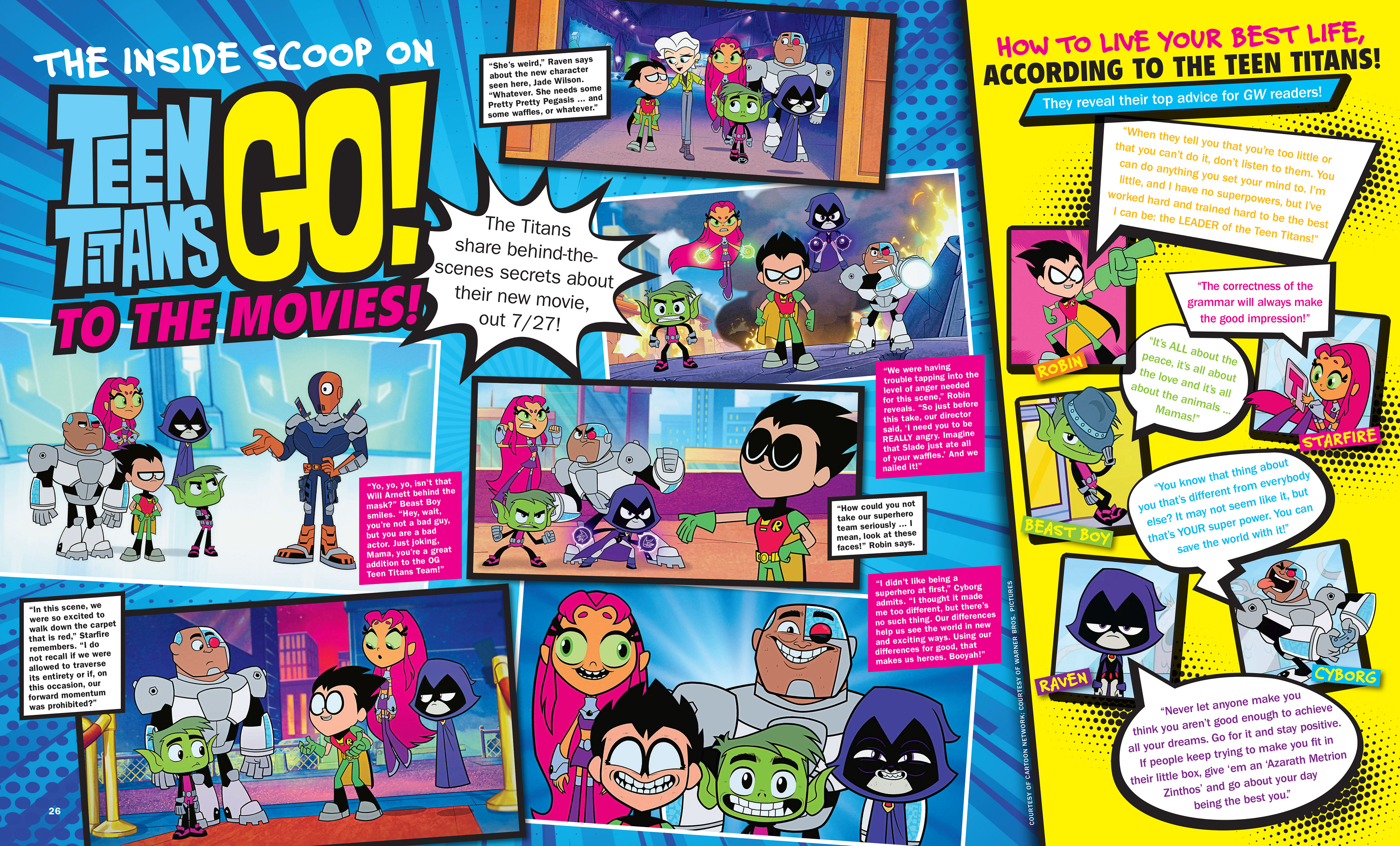
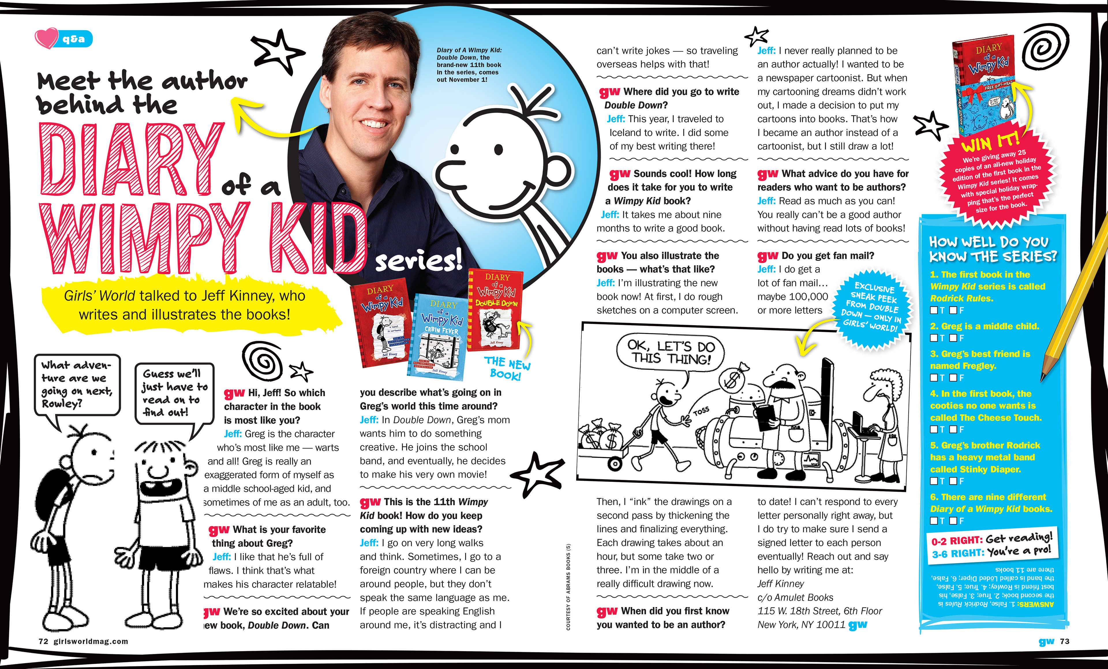
During my career as an editorial designer, I had the privilege of creating new magazines from the ground up. The challenge was finding ways to make the design engaging enough for kids to immerse themselves in the content while still having fun reading it.
I developed full branding systems for all three magazines. This included designing new logos (nameplates), selecting a versatile set of typefaces to support a variety of content styles, and creating vibrant color palettes that spanned the entire color wheel with thoughtful variations in tint and shade. I also built structured templates to maintain consistency, while allowing flexibility to break out of the mold when needed—bringing in depth, creativity, and a sense of play.
